
Note
Go to the end to download the full example code.
Kernel interpolation for concentration#
When a dye traces a curved path through colour space as its concentration
changes, a linear model is not enough. KernelInterpolation
learns the signal-to-concentration map from a handful of labelled samples.
The images come from a water-tracer experiment with a multi-coloured indicator (green ~100 %, blue ~0 %); they have been cropped and down-sampled for storage.
import os

import matplotlib.pyplot as plt
import numpy as np
import skimage

import darsia

folder = os.path.join("..", "images")
baseline = darsia.imread(os.path.join(folder, "kernel_interpolation_example_base.npz"))
image = darsia.imread(os.path.join(folder, "kernel_interpolation_example_test.npz"))
Start with a model-free concentration analysis: just the TV-denoised difference to the baseline.
analysis = darsia.ConcentrationAnalysis(
    base=baseline,
    restoration=darsia.TVD(
        weight=0.025, eps=1e-4, max_num_iter=100, method="isotropic Bregman"
    ),
    **{"diff option": "plain"},
)
/home/runner/work/DarSIA/DarSIA/src/darsia/multi_image_analysis/concentrationanalysis.py:86: UserWarning: The baseline image needed to be converted to float for substraction.
  warn(
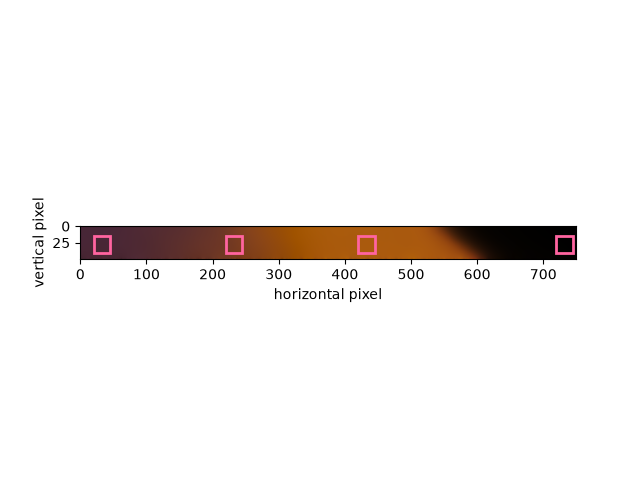
Pick a few sample windows with known concentrations. Interactively this would
be BoxSelectionAssistant; here the windows are hard-coded.
samples = [
    (slice(15, 40), slice(20, 45)),
    (slice(15, 40), slice(220, 245)),
    (slice(15, 40), slice(420, 445)),
    (slice(15, 40), slice(720, 745)),
]
n = len(samples)
concentrations = 100 * np.append(np.linspace(1, 0.99, n - 1), 0)
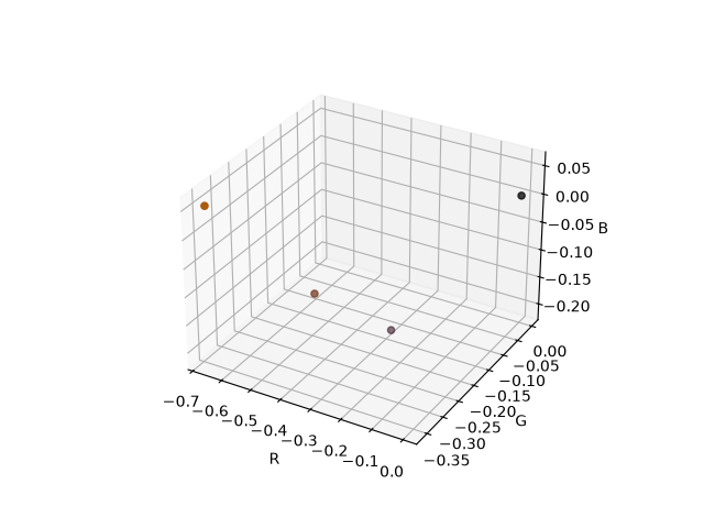
Extract the characteristic colour of each sample and fit a Gaussian-kernel interpolation, clipped at 100 %.
smooth_rgb = analysis(image).img
colors_rgb = darsia.extract_characteristic_data(
    signal=smooth_rgb, samples=samples, show_plot=True
)
analysis.model = darsia.CombinedModel(
    [
        darsia.KernelInterpolation(
            darsia.GaussianKernel(gamma=9.73),
            supports=colors_rgb,
            values=concentrations,
        ),
        darsia.ClipModel(**{"max_value": 100.0}),
    ]
)
/home/runner/work/DarSIA/DarSIA/src/darsia/multi_image_analysis/concentrationanalysis.py:252: UserWarning: The input for concentration analysis needed to be converted to float.
  warn(
/home/runner/work/DarSIA/DarSIA/src/darsia/utils/extractcharacteristicdata.py:173: RuntimeWarning: Assuming data is color data and using RGB as axes.
  warn("Assuming data is color data and using RGB as axes.", RuntimeWarning)
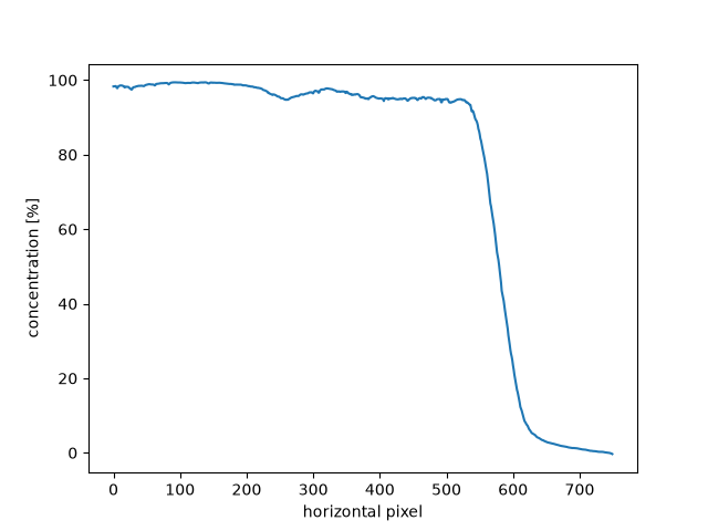
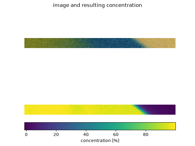
Apply the calibrated analysis and visualise the result.
concentration_image = analysis(image).img

plt.figure("concentration profile")
plt.plot(np.average(concentration_image, axis=0))
plt.xlabel("horizontal pixel")
plt.ylabel("concentration [%]")

fig = plt.figure()
fig.suptitle("image and resulting concentration")
ax = plt.subplot(211)
ax.imshow(skimage.img_as_ubyte(image.img))
ax.set_axis_off()
ax = plt.subplot(212)
im = ax.imshow(concentration_image)
ax.set_axis_off()
fig.colorbar(im, orientation="horizontal", label="concentration [%]")
plt.show()
Total running time of the script: (0 minutes 6.586 seconds)